
- Mar 19
- 6 min read
Updated: Mar 27
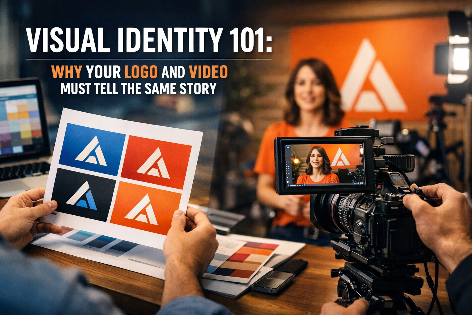
You've invested in a cinematic video that captures your mission perfectly. Your website looks sharp. But something feels off when a prospect lands on your homepage after seeing your content on LinkedIn.
The video uses bold, energetic typography. Your logo is minimal and sophisticated. The brand colors in your graphics don't match what's on screen. And suddenly, your carefully crafted story starts to fracture.
Visual identity isn't just your logo: it's the complete visual language that tells your audience who you are before they read a single word. When your video contradicts that language, you're not building brand recognition. You're building confusion.
Here's why your logo, video, and every visual touchpoint need to speak the same language: and how we make sure they do.
Your Logo Is a Promise. Your Video Should Keep It.
Your logo does heavy lifting in a single glance. It distills your brand promise: your values, your positioning, your vibe: into a mark that fits on a business card.
But a logo can't tell a story alone.
That's where video comes in. Video adds narrative depth, emotional resonance, and proof that you deliver on what your logo implies. When a prospect sees your logo, they should feel the same thing they felt watching your video. Same tone. Same energy. Same core message.
When those two conflict, you've created cognitive dissonance. A minimalist, high-trust logo paired with a loud, chaotic video? That disconnect weakens recall and makes it harder for people to remember what you actually stand for.
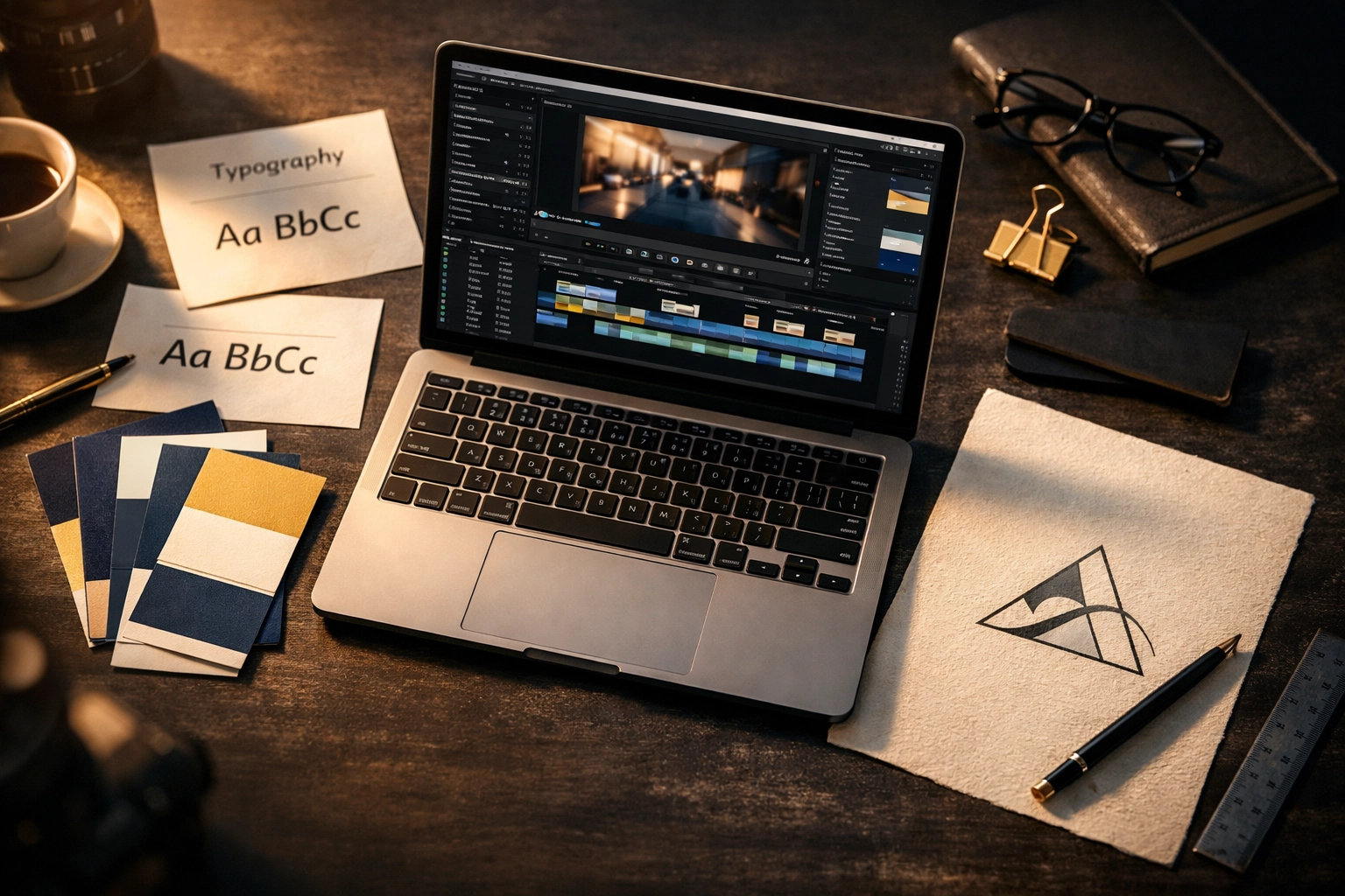
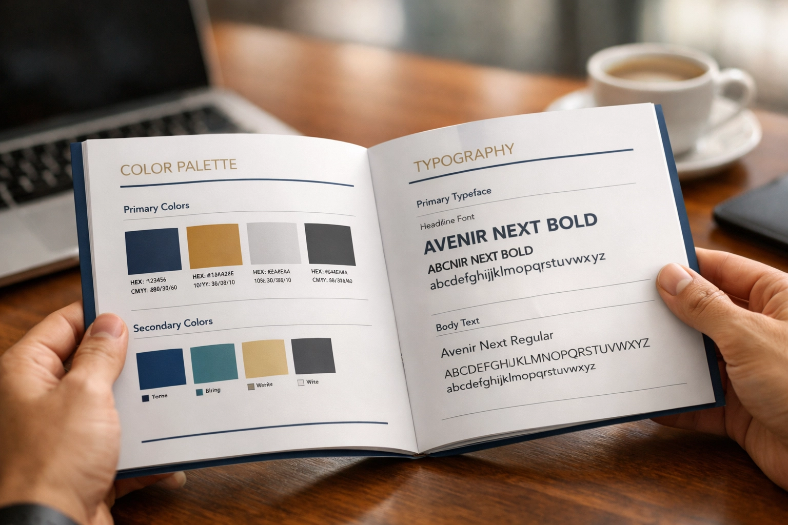
Visual Identity Is Bigger Than Your Logo
Most brands think visual identity stops at the logo file. It doesn't.
Your complete visual identity includes:
Logo and logomark variations (horizontal, stacked, icon-only)
Typography (headlines, body copy, callouts)
Color palette (primary, secondary, accent colors with specific hex codes)
Photography and video style (lighting, composition, subject treatment)
Graphic elements (patterns, icons, shapes that reinforce your brand)
Motion design (how elements move, transition speeds, animation style)
Every one of these elements either reinforces your story or contradicts it.
If your brand identity guide says your primary typeface is a clean sans-serif that communicates precision, but your video uses a hand-drawn script font over every title card, you're telling two different stories. One says "trust us with the details." The other says "we're whimsical and spontaneous."
Consistency across all these elements is what makes your big idea stick. Research shows that infusing your story with cohesive visual elements is the most effective way to make your brand memorable. Inconsistency dilutes that impact and makes your message forgettable.
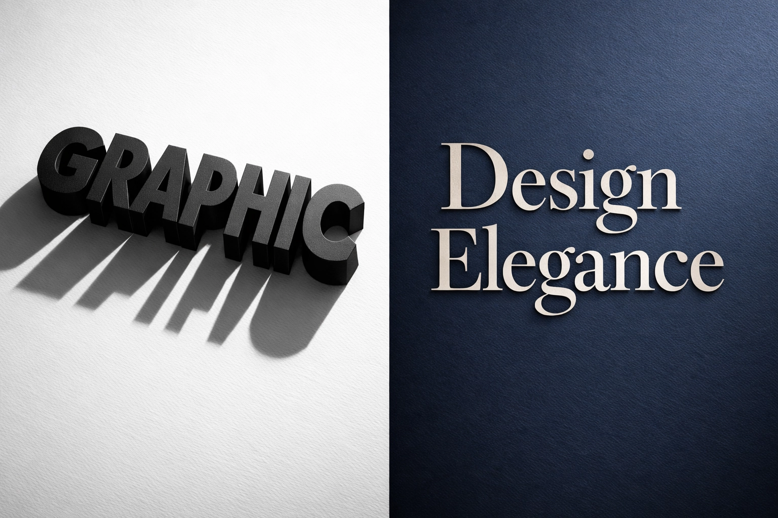
Typography Tells a Story Before Words Do
Let's talk type for a second.
The font you choose for your logo, your website headers, and your video titles isn't just aesthetic. It's strategic. Typography carries psychological weight.
A bold, geometric sans-serif communicates strength, modernity, and clarity. A serif font signals tradition, trust, and authority. A handwritten script suggests creativity, warmth, and approachability.
When your logo uses one and your video uses another without intentionality, you've fractured the emotional experience. Your audience doesn't consciously think "the fonts don't match," but they feel the disconnect. It registers as "something's off," and that subtle friction erodes trust.
We treat typography as a storytelling tool. If your brand voice is confident and strategic, we carry that into every title card, every graphic overlay, every caption. The type reinforces the tone you've already set with your logo and brand guidelines.
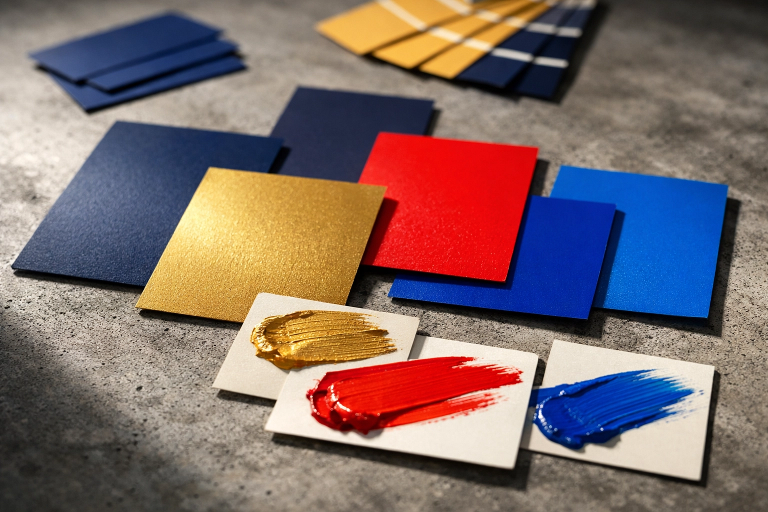
Color Psychology Isn't Optional
Color is one of the fastest ways your brain processes brand identity. Before a viewer reads your headline or hears your voiceover, they've already made subconscious judgments based on the colors on screen.
Your brand colors should be deliberate, not arbitrary. And once you've chosen them, they need to show up consistently: in your logo, on your website, in your video.
If your brand palette is navy and gold to communicate trust and premium value, but your latest video is full of bright reds and electric blues, you've undermined your positioning. The colors are screaming "urgency and energy" while your logo whispers "stability and expertise."
Color consistency creates instant recognition. When someone sees your brand blue in a thumbnail, in an email header, and in the lower third of your video, they know it's you before they even process the content. That's the power of a cohesive visual identity.
We make sure your brand palette doesn't just live in a PDF guide: it lives in every frame, every graphic, every web page we create.
How Inconsistency Undermines Trust (Especially for Nonprofits and B2B)
Here's where this gets strategic.
If you're a nonprofit asking donors to trust you with their money, or a B2B company pitching a six-figure contract, visual inconsistency signals operational inconsistency.
A prospect might not articulate it this way, but the thought process goes something like this: "If they can't keep their own brand together, how are they going to manage my project? If their video and website feel like they were made by different companies, do they even have internal alignment?"
It's not fair. But it's real.
High-stakes decision-makers are looking for signals of competence, professionalism, and attention to detail. Your visual identity is one of those signals. When it's fractured, it raises red flags.
On the flip side, when your logo, video, web design, and marketing materials all feel like they came from the same strategic brain, it creates confidence. It says, "We know who we are. We're intentional. We have our act together."
The Integrated Approach: Strategy First
This is where most agencies fail you.
They'll sell you a logo design. Then a different team makes your video. Someone else builds your website. And nobody is thinking about how these pieces fit together into one cohesive story.
We don't operate that way.
At South Town Productions, we take a Strategy First approach. That means before we shoot a single frame or design a single graphic, we make sure your visual identity is aligned across every touchpoint: video, web, SEO, and design.
Here's what that looks like in practice:
Brand audit: We start by understanding your current visual identity. What's working? What's sending mixed signals? Where's the disconnect?
Unified design language: We develop (or refine) a visual identity system that works across all media: logo, typography, color, photography style, motion design.
Integrated production: When we create your video, we're not guessing at colors or fonts. We're pulling directly from the same brand guide that informs your website design and your SEO-optimized blog graphics.
Consistency across platforms: Whether someone sees you on LinkedIn, lands on your homepage, or watches your testimonial video, the experience feels unified. Same tone. Same look. Same story.
This isn't just about aesthetics. It's about making sure every dollar you invest in marketing reinforces the same brand message. No wasted effort. No mixed signals.
Your Visual Identity Should Scale With You
Another thing to consider: your visual identity needs to work everywhere.
Your logo needs to look sharp on a website header, a video intro, a social media icon, and a printed brochure. Your brand colors need to reproduce accurately on a 4K screen and a low-res mobile device. Your typography needs to be readable in a 15-second Instagram Story and a long-form documentary.
When we build your visual identity, we're thinking about scalability. We're making sure the assets we create today will serve you across every platform and format you'll use tomorrow.
That means:
Responsive logos (horizontal, stacked, icon-only versions)
Accessible color palettes (meeting WCAG contrast standards for readability)
Versatile typography (web-safe fonts with fallback options)
Flexible motion templates (that adapt to different aspect ratios and video lengths)
Your brand shouldn't have to compromise when it shows up in a new place. It should feel confident and consistent no matter where your audience finds you.
It Gives Your Team a Playbook
Here's an underrated benefit of a unified visual identity: it empowers your internal team.
When everyone is working from the same brand guide, your team knows exactly how to represent your organization. Your marketing coordinator knows which fonts to use. Your social media manager knows which colors are on-brand. Your development director knows what style of photography reinforces your mission.
This internal alignment creates pride. It eliminates guesswork. And it ensures that even when different people are creating content, it all feels like it's coming from the same strategic vision.
Without that playbook, you get chaos. One person uses the wrong logo file. Someone else picks colors that "look close enough." And slowly, your brand identity drifts.
We give you that playbook. And we use it ourselves every time we create something for you.
Final Thoughts
Your logo and your video aren't separate marketing assets. They're two parts of the same story: and they need to tell it together.
When your visual identity is cohesive across video, web, and design, you build the trust and recognition that drives real growth. That's especially critical for nonprofits and purpose-driven organizations, where credibility and clarity are everything.
At South Town Productions, we don't just make beautiful videos or sharp websites. We manage your full visual story with a Strategy First approach that aligns every touchpoint around your mission.
If you're ready to make sure your logo and your video are finally telling the same story, let's talk.